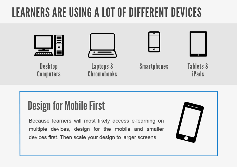
Learners will often access e-Learning modules on multiple devices, including phones and tablets. If there is any possibility that your learners will be using mobile devices, there is high value in designing with a “mobile-first” mindset. Design for mobile devices and smaller screens first, and then scale your designs to larger desktop or laptop screens.
Want to know more? Check out this infographic I recently created (If the embedded image loads slow, the direct link is at Mobile e-Learning Design).
